A collection of various brand logos created throughout this year.
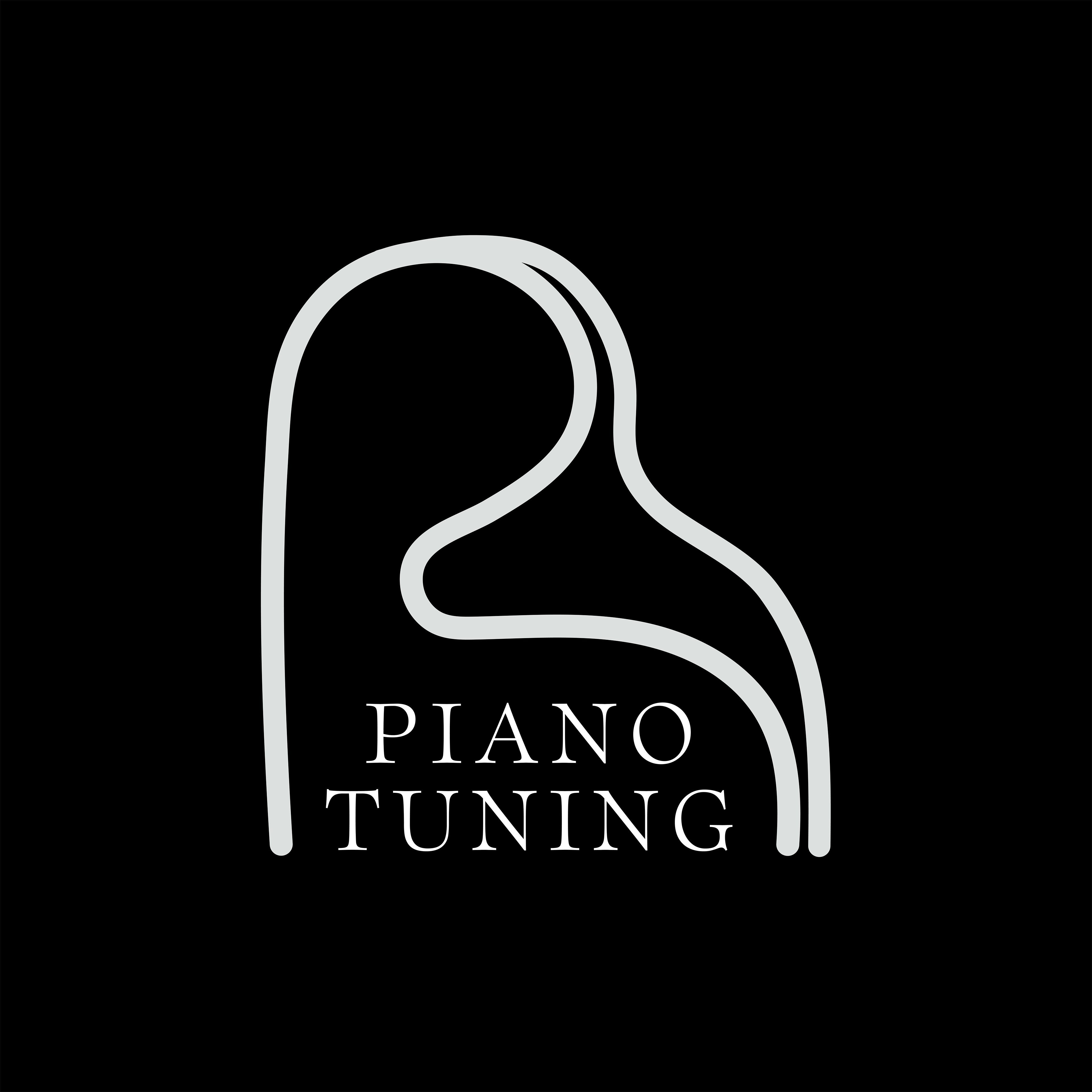
Logo created for "Professional Tuning Services by Ryan," a piano tuning business. The lines form a the shape of the "R" for Ryan as well as the outline of a grand piano. A black and white version of the logo was created, as well as the inverted version (featured here).

WIP (Work in Progress) is a men’s formation brand centered around growth, restoration, and building identity from the inside out. The goal was to create a visual identity that feels strong, grounded, and architectural—while still communicating vulnerability, process, and becoming. The wordmark is designed to function like a structure under construction and the client wanted to keep the rough architectural lines to symbolize the ongoing process of growth.
Original logo: The client wanted more movement and flow while
keeping the elements of the arrows and color palette.

The final redesigned logo.
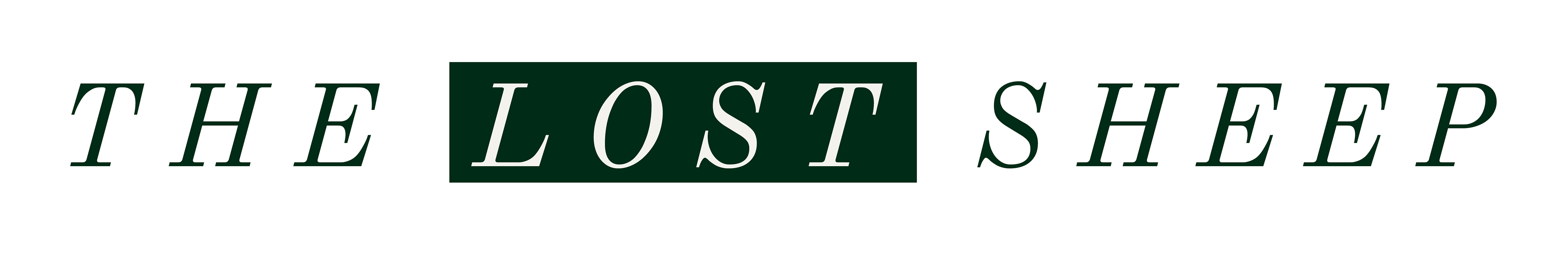
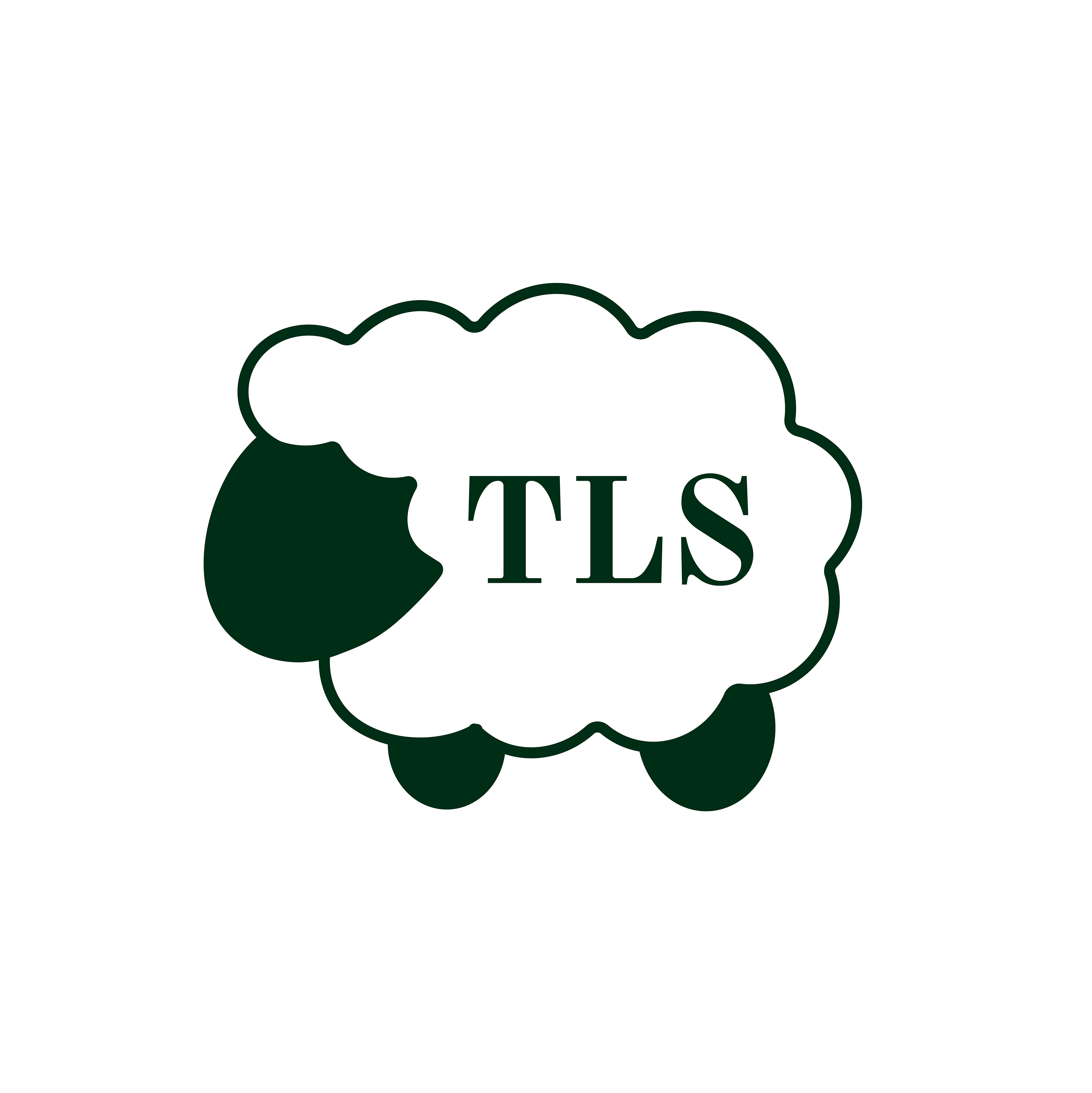
Icon and logo created for "The Lost Sheep Podcast." Dark green was the primary color (with a light stone as the secondary color). Branding vision was to maintain a minimal, luxury, and cute aesthetic.